Most people wouldn't give a Macy's department store a second glance—but I'm not most people.
Besides, even though it happened long before I arrived in California, I know how Macy's took over some of the historic Robinson's department stores (like in Woodland Hills and Newport Beach).
I can only assume there are more historic treasures hiding behind a Macy's logo elsewhere in SoCal.
Which brings me to the Macy's on Lake Avenue in Pasadena, California.
Every time I'd drive past it, I'd marvel at what I assumed—but didn't really know—to be a landmark shopping destination. It dominates Lake Avenue, with its wide, low profile—and its Streamline Moderne elements on the north wing catching the eyes of passerby drivers like me.
I'd always wondered what it was like inside, but I'd always be on my way to something else—and wouldn't make time to stop and go in.
That changed when Pasadena Heritage recently offered a tour of Macy's Lake Avenue—which turns out to be the former Pasadena location of Bullock's department store.
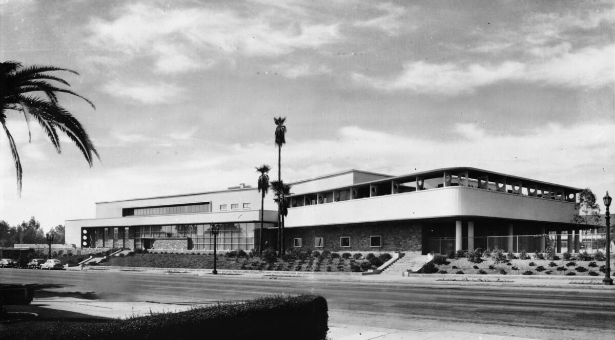
Photo: "Dick" Whittington Photography Collection, USC Digital Library
Bullock's was built upon natural sloping terrain—so that it hugs the ground as it sits upon an elevated terrace above Lake Avenue, which was mostly residential prior to its arrival. Fifty homes were plowed for the construction project.
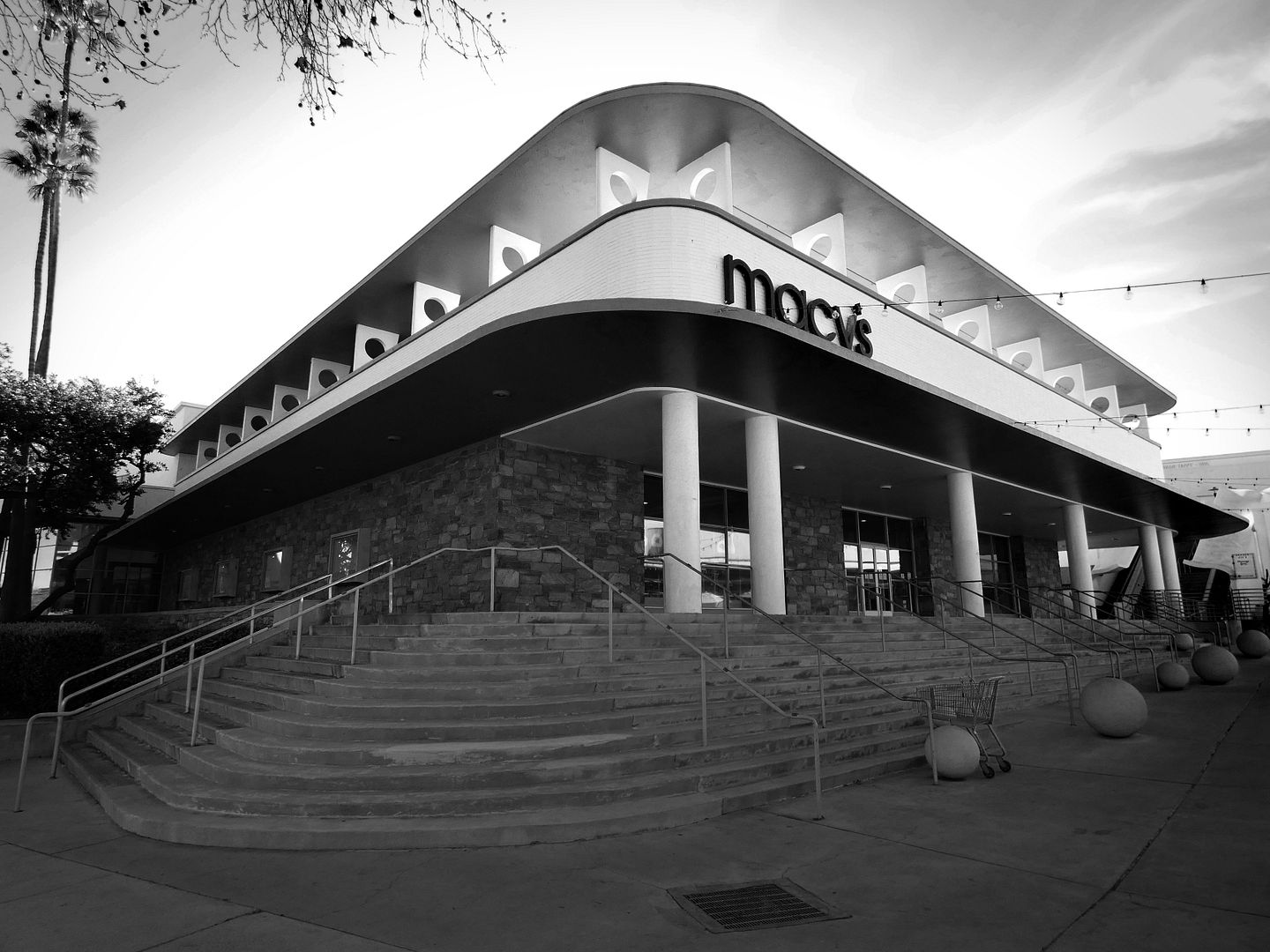
Its arrival in Pasadena in 1947 was part of the suburbanization that was happening all over the country during the post-WWII economic boomtime (though, according to Devin T. Frick's Images of America book Bullock's Department Store, planning for it had begun even before the war started).
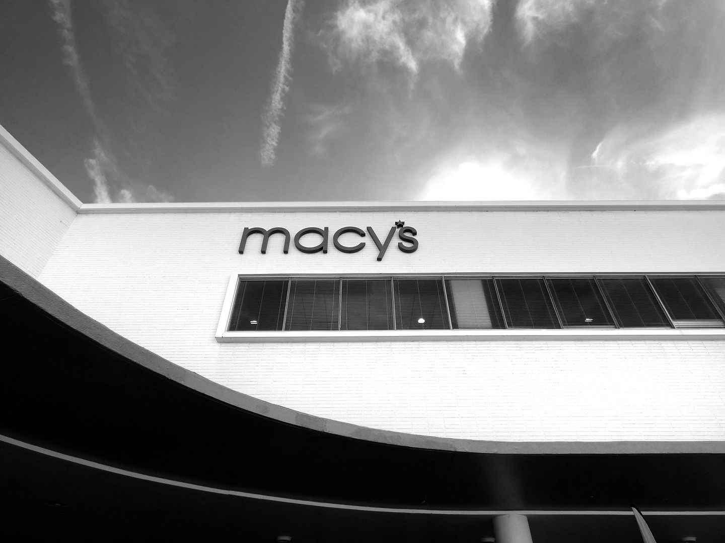
It was designed by the architectural team of Walter Wurdeman & Welton Becket as a motorist-oriented building—even though when it opened, the Red Car trolley was still running down Lake Avenue. And because they expected shoppers to drive there, they included in their plans a 6-acre surface parking lot that surrounded the building on three sides.
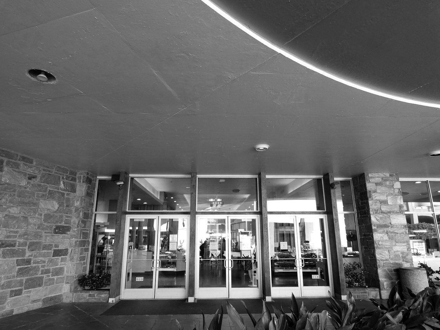
The arrival of Bullock's on Lake Avenue shifted attention away from the established shopping district on Colorado Boulevard (now "Old Town Pasadena"). Designed and marketed as a "store for all Southern California," the hope was to lure upper middle class Pasadenans and other denizens of the San Gabriel Valley and beyond who were looking for a shopping experience that would combine "distinction and moderate prices."
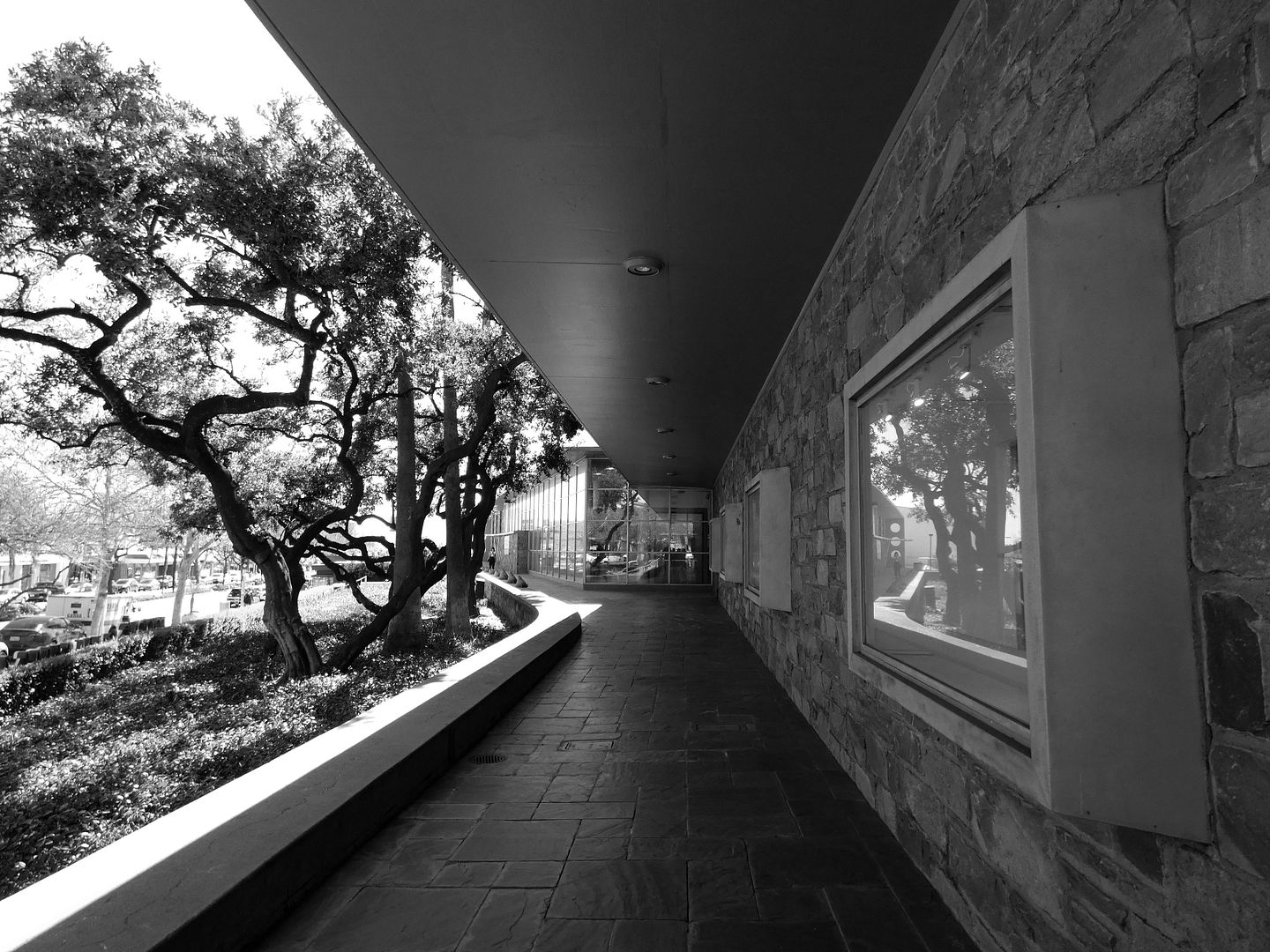
It was built of reinforced concrete, clad in Pennsylvania fieldstone, and enhanced by landscaping designed by Ruth Shellhorn (who later worked on the original landscaping for Disneyland).
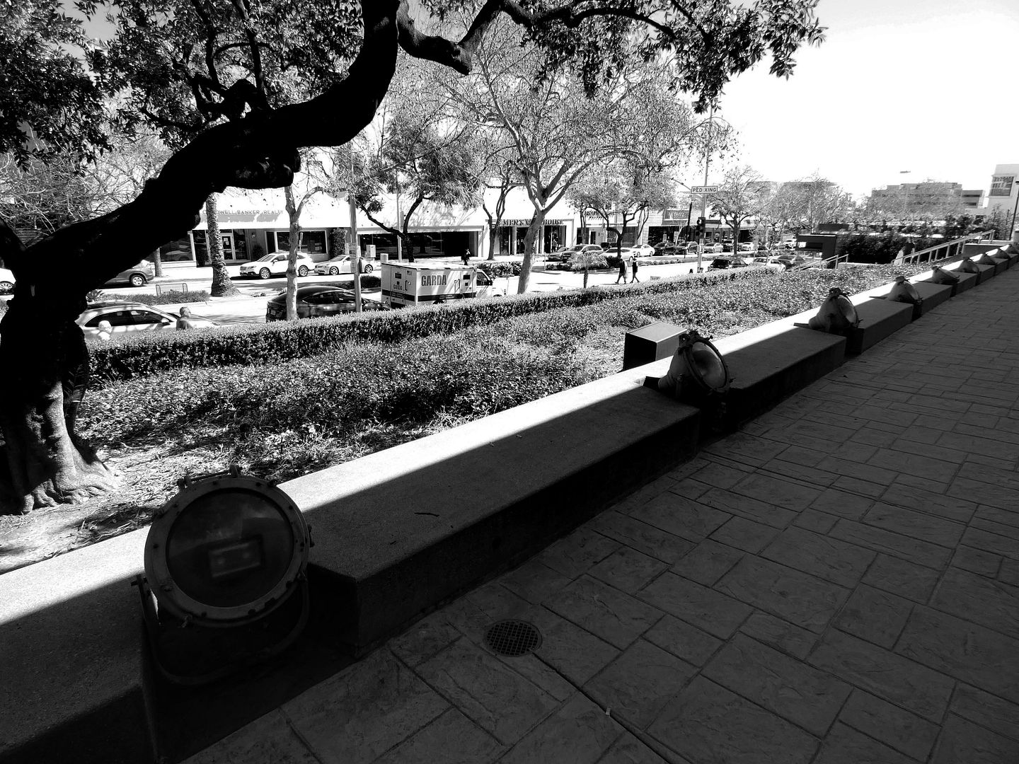
Its design was literally highlighted by Westinghouse spotlights (still there today) along the Virginia greenstone walkways of the east façade—for illuminating the building at night.
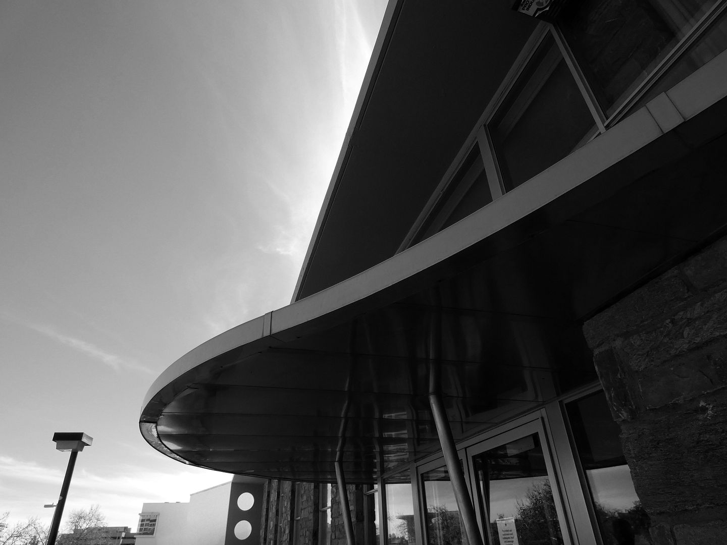
It received landmark status on a national level in 1996—but it was later threatened by incoming development, whose proposed design appeared to essentially swallow it up (though thankfully not demolish it).
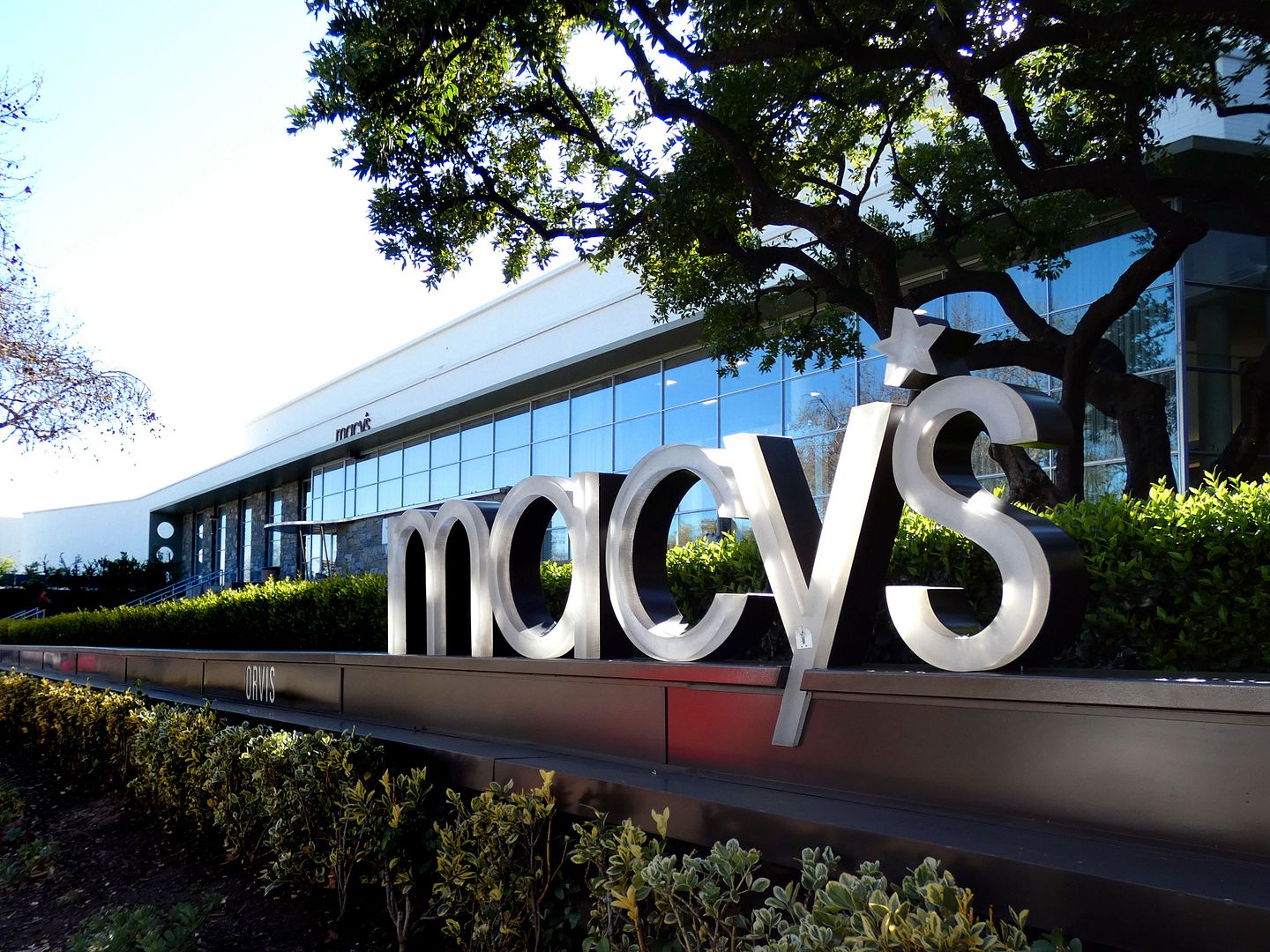
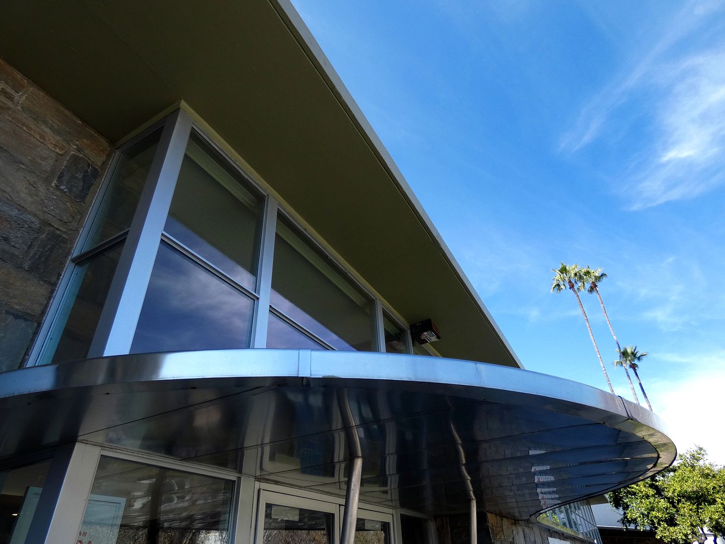
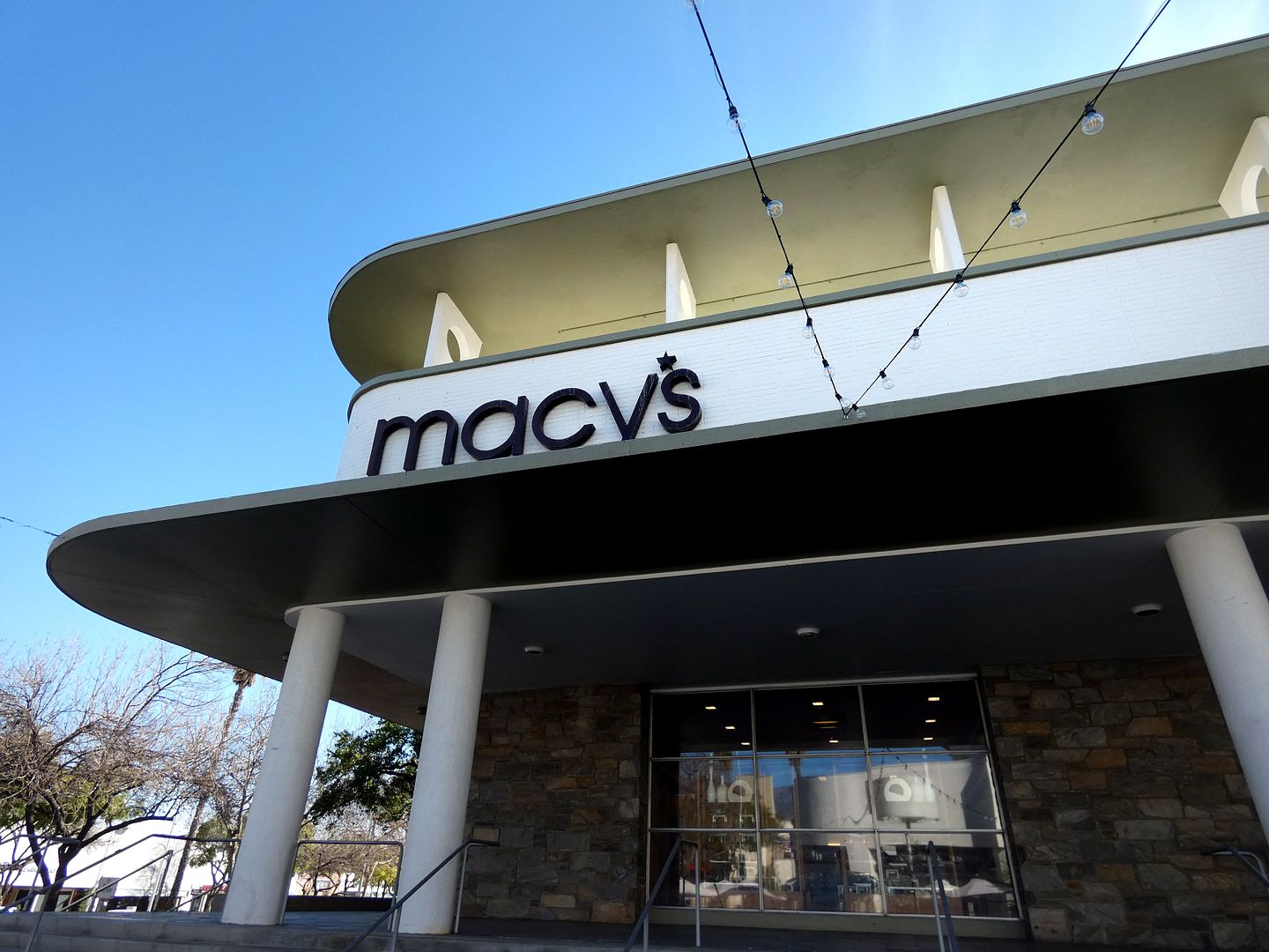

But as a result of the preservation efforts of Pasadena Heritage, the Bullock's building—now Macy's—became an attention-grabbing centerpiece of The Shops on Lake Avenue development (opened in 2002).

The Lake Avenue pedestrian entrance, with its undulating curves, is secondary to the more contemporary parking structure in the back—as it was back then as well, when the focus was pulled to the two motor courts (one off Lake Avenue and one off Del Mar). There, a doorman could place purchases in the trunk of a waiting vehicle—decades before "curbside pickup" became a common thing.

The Pasadena location of Bullock's was originally designed to offer the atmosphere of a private home (perhaps like the Craftsmans that once surrounded it) or a country club—even though it looks more like a cruise ship from the outside, with its multiple "decks".

And while change has happened inside, as change always does, there's a lot of that original 1947 shoppers' paradise to be discovered.

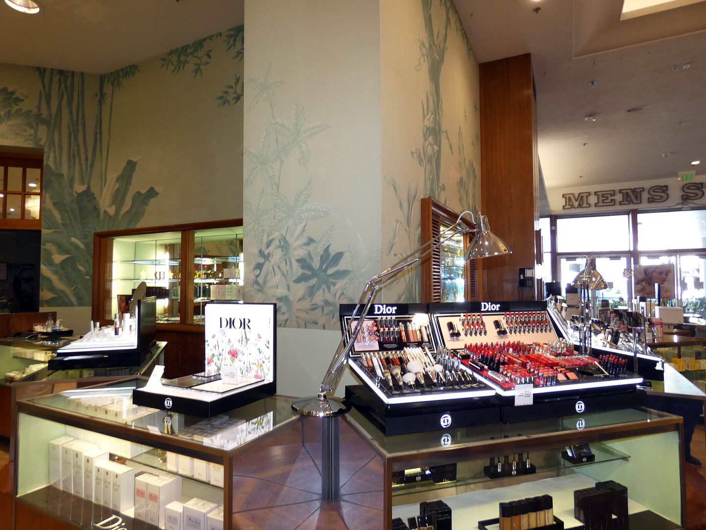
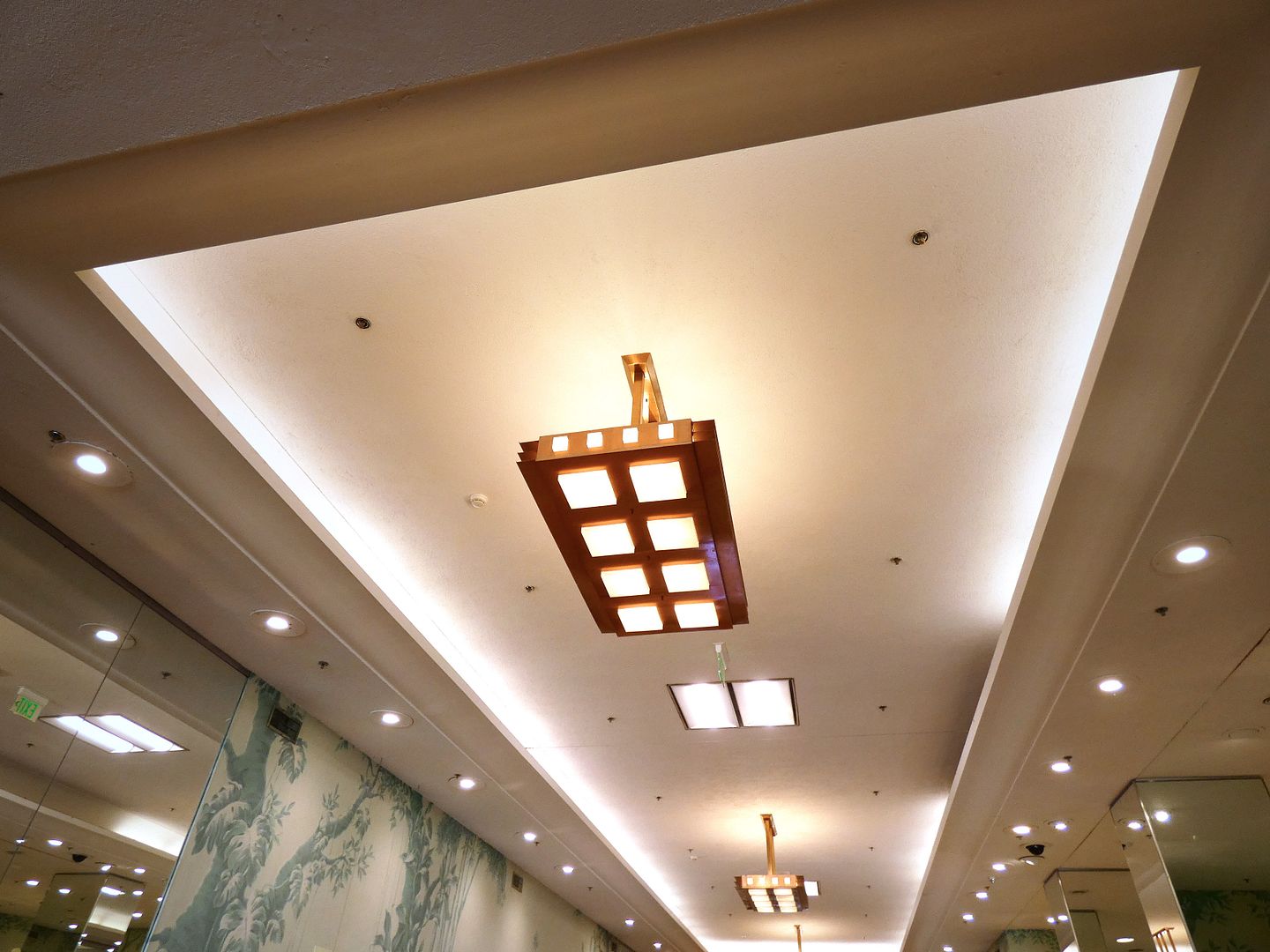
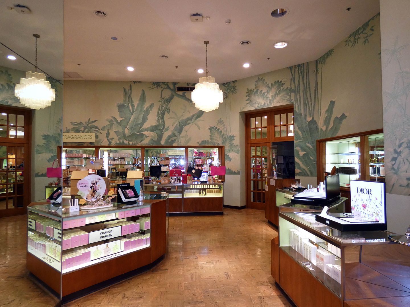
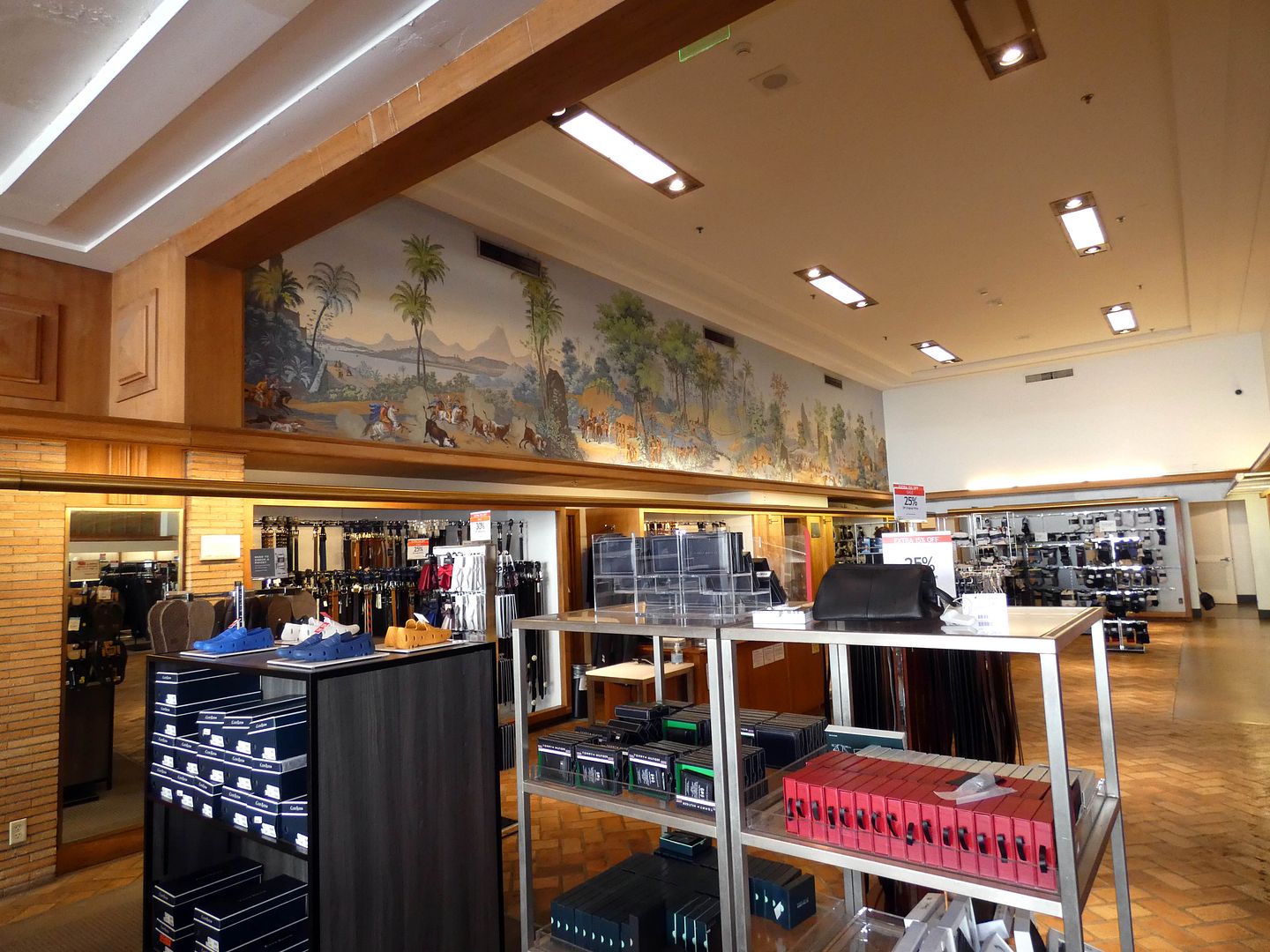
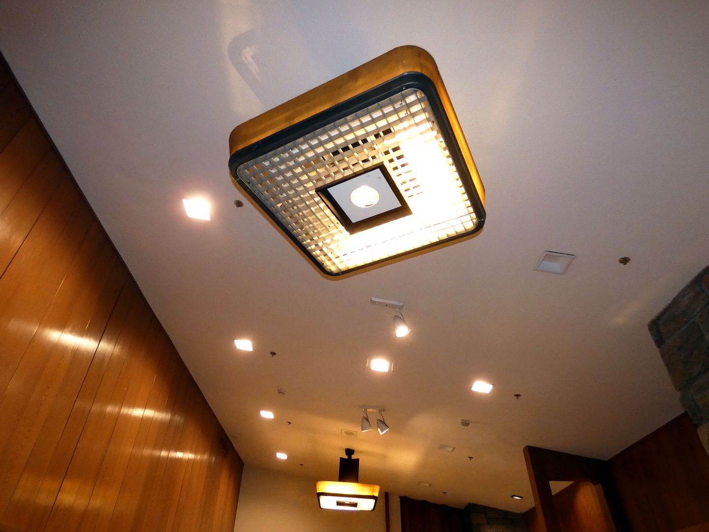
On the ground floor, or "Middle Level" (marked as "M" in the elevators), the cosmetics department (once known as "The Toiletries Gallery") features original copper ceiling lighting fixtures, original hand-painted wallpaper murals by Annette Honeywell)...

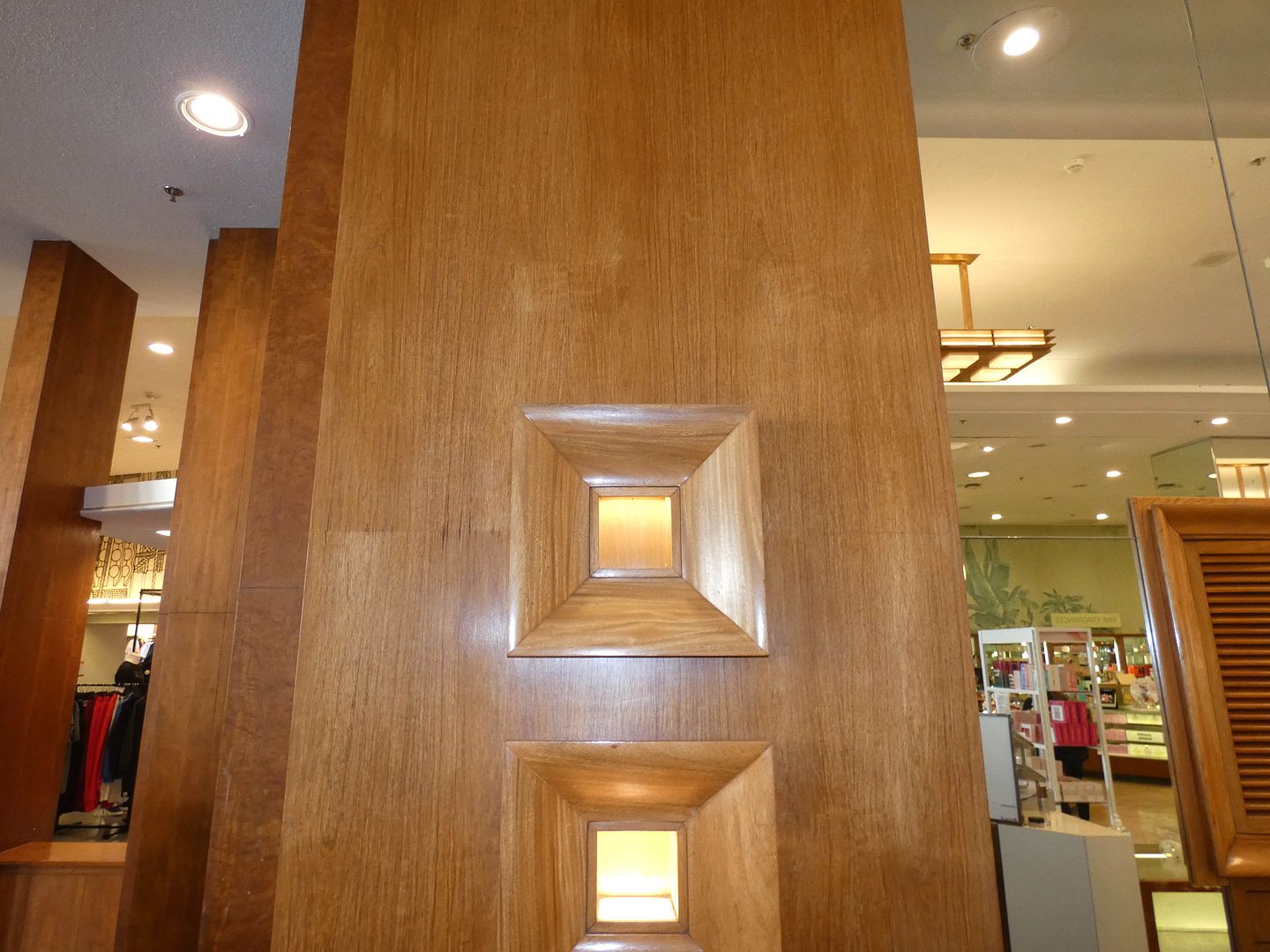
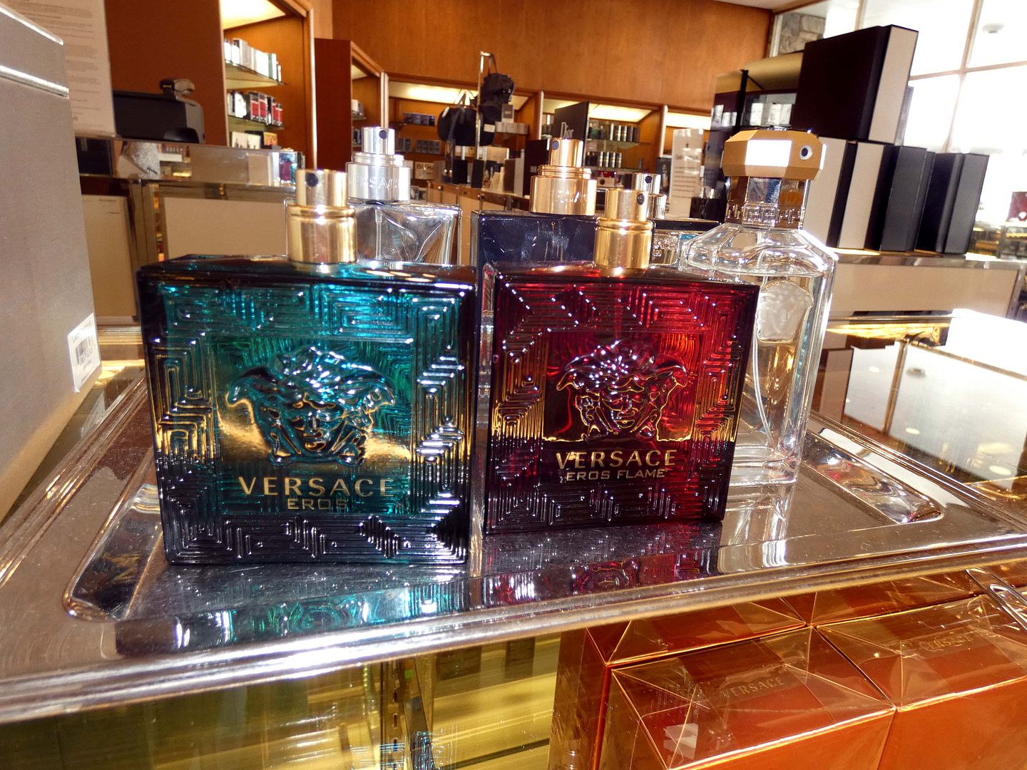
...and wooden cases with lit niches for displaying a single perfume bottle...

...although now they're just merchandised on top of the the counters and glass cases.

In 1973, that department was opened up as part of an expansion—and the display cases, wallpaper, and rubber tile flooring (in a tan, copper, and brown marbleized color scheme) were reproduced practically seamlessly.

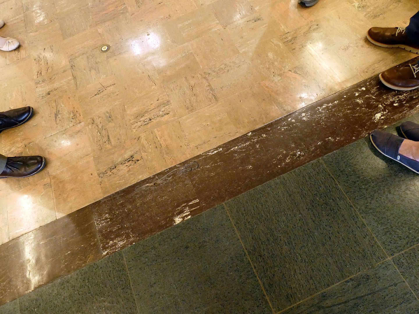
It's incredible how much of the architectural details are original—including areas where multiple different flooring styles come together. Unfortunately, although 400 different shades of color were incorporated throughout the various materials used in the interior design, many of them have been lost to repainting.

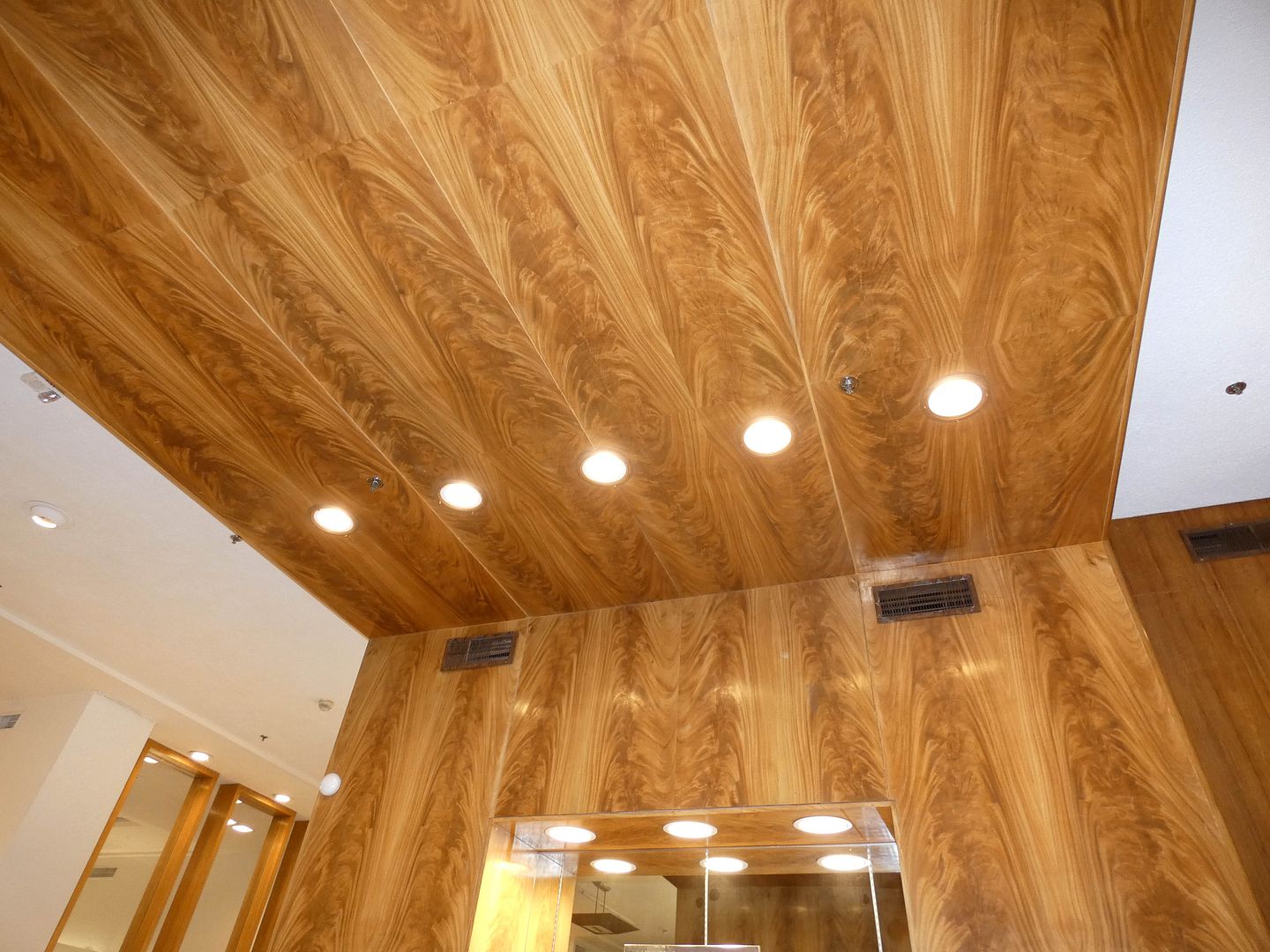
Wurdeman and Becket actually incorporated more than 220 varieties of wood throughout the store—including Brazilian rosewood, Honduras mahogany, Natural East India rosewood, teak, maple, oak, and more.

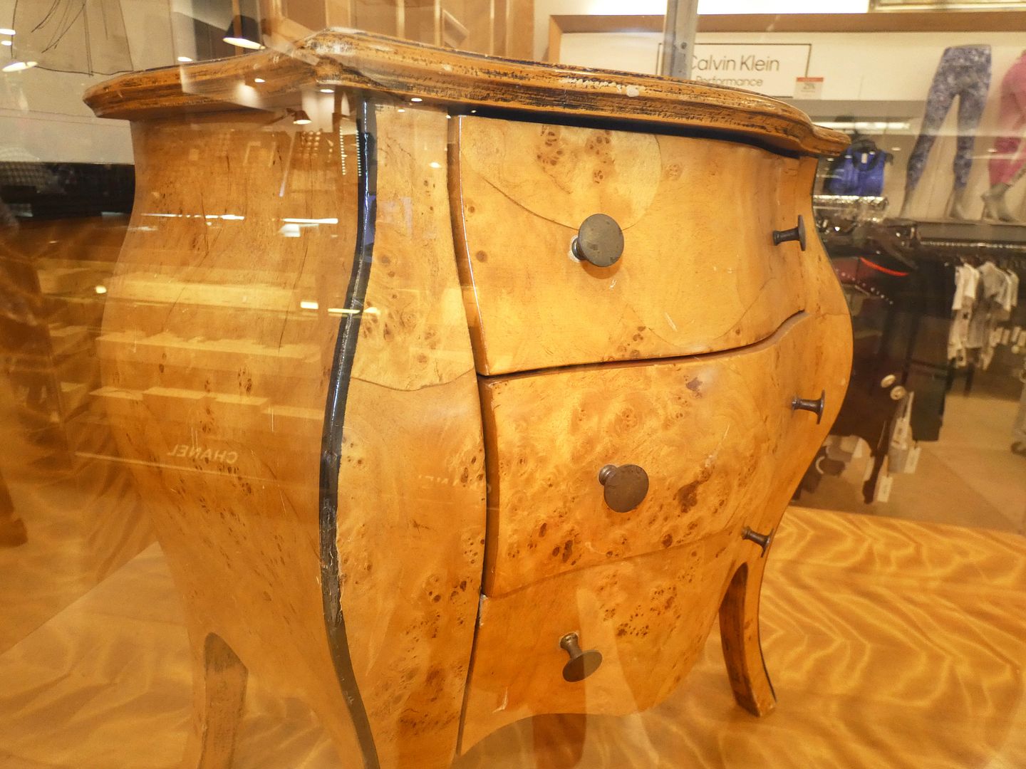
It was the first example of their the “total design” approach—expanding their role beyond architectural designs, master planning, and structural engineering to also incorporate interiors, like fixtures and furnishings (in collaboration with Bullock's corporate interior designer, Raymond C. Dexter). Two antique burl wood miniature end tables are currently on display in glass cases in today's women's department.

All in all, 61 individual specialty shops were created—each compartmentalized with its own design motif, even including a Victorian candy shop (which has unfortunately been removed). That was a pretty groundbreaking concept at the time—which is perhaps why Bullock's marketed this location as "The Store of Tomorrow."

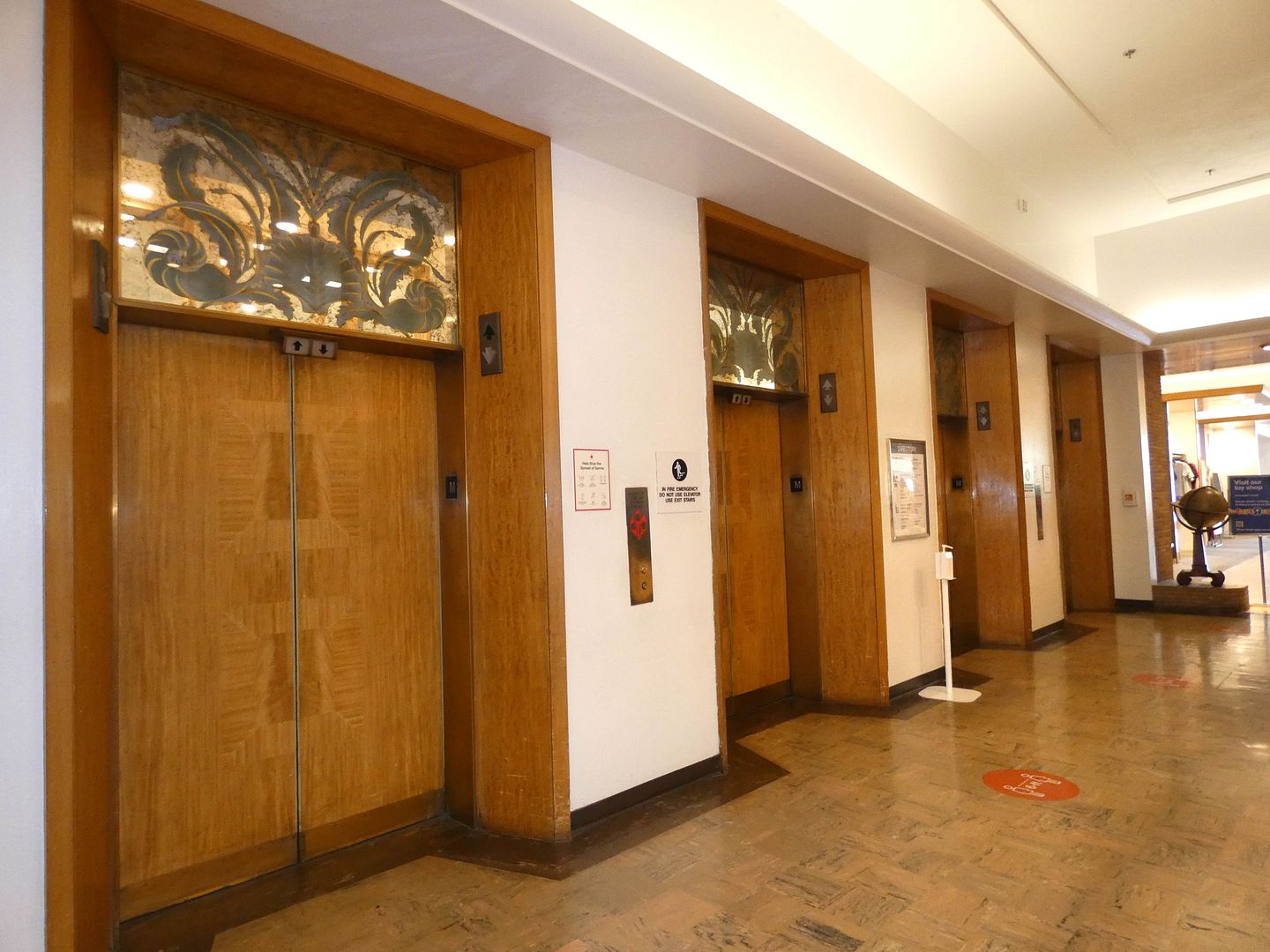
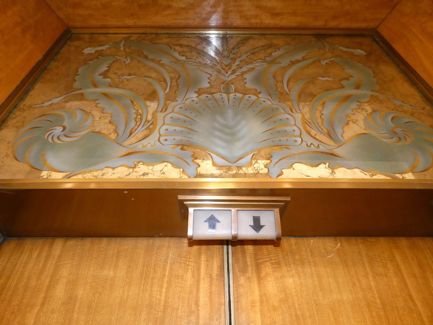
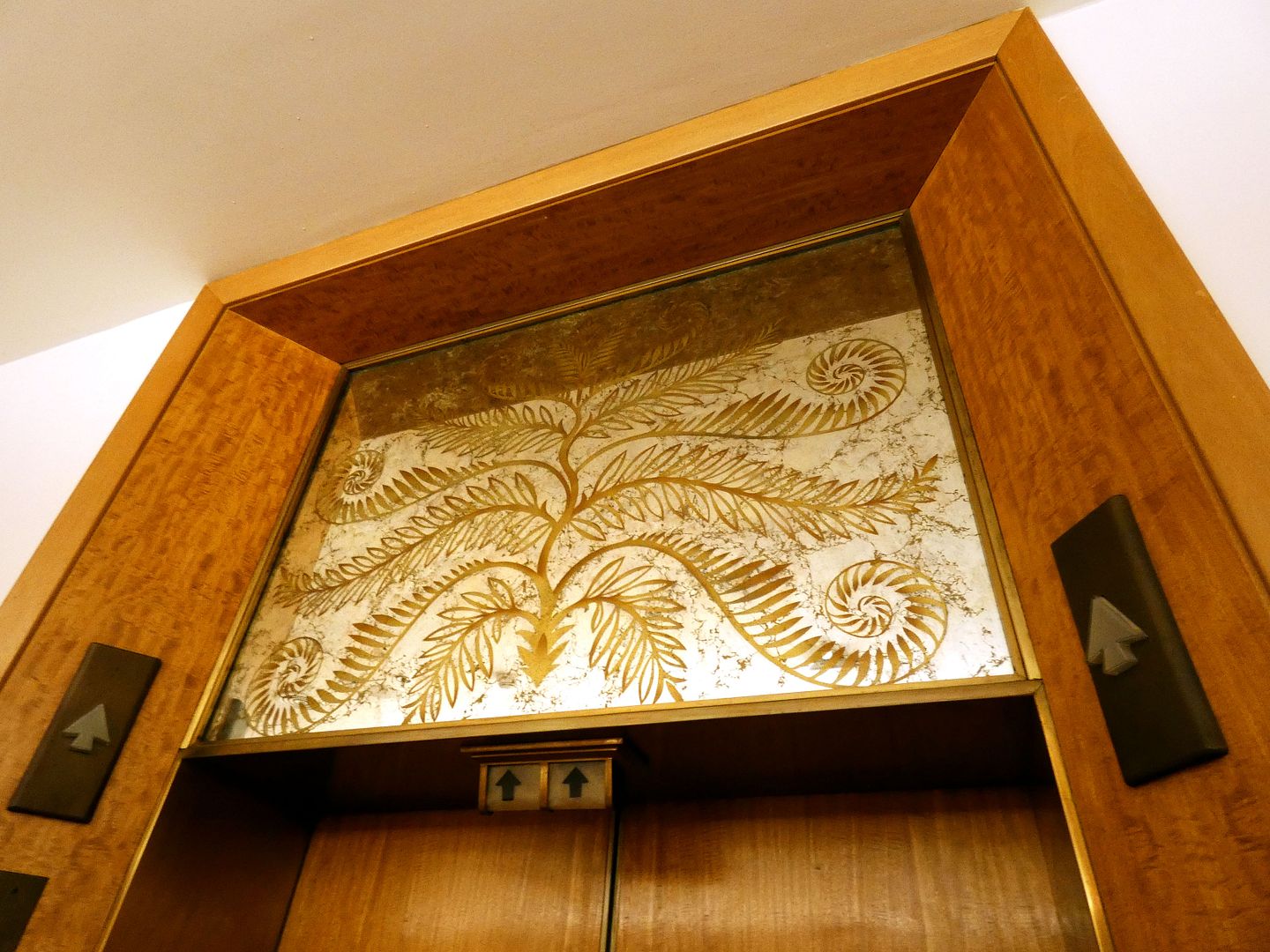
Aside from a single stairwell, the way to move about between the three floors of departments was to take the modern, automated elevator—whose back-painted decorative mirrors also featured designs by Honeywell (like of conch shells, flowers, and other tropical elements).

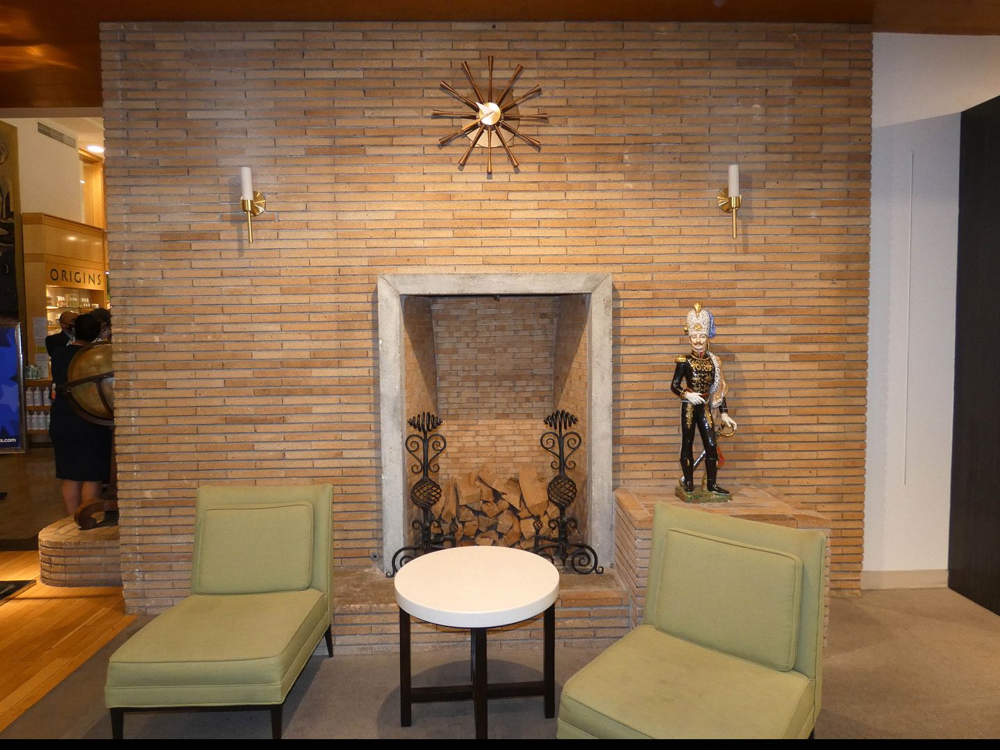
When Macy's closed in 2008 for a restoration and earthquake retrofit (yes, during the economic recession), two fireplaces that had been boarded up were uncovered, including one by the entrance to the elevator foyer.

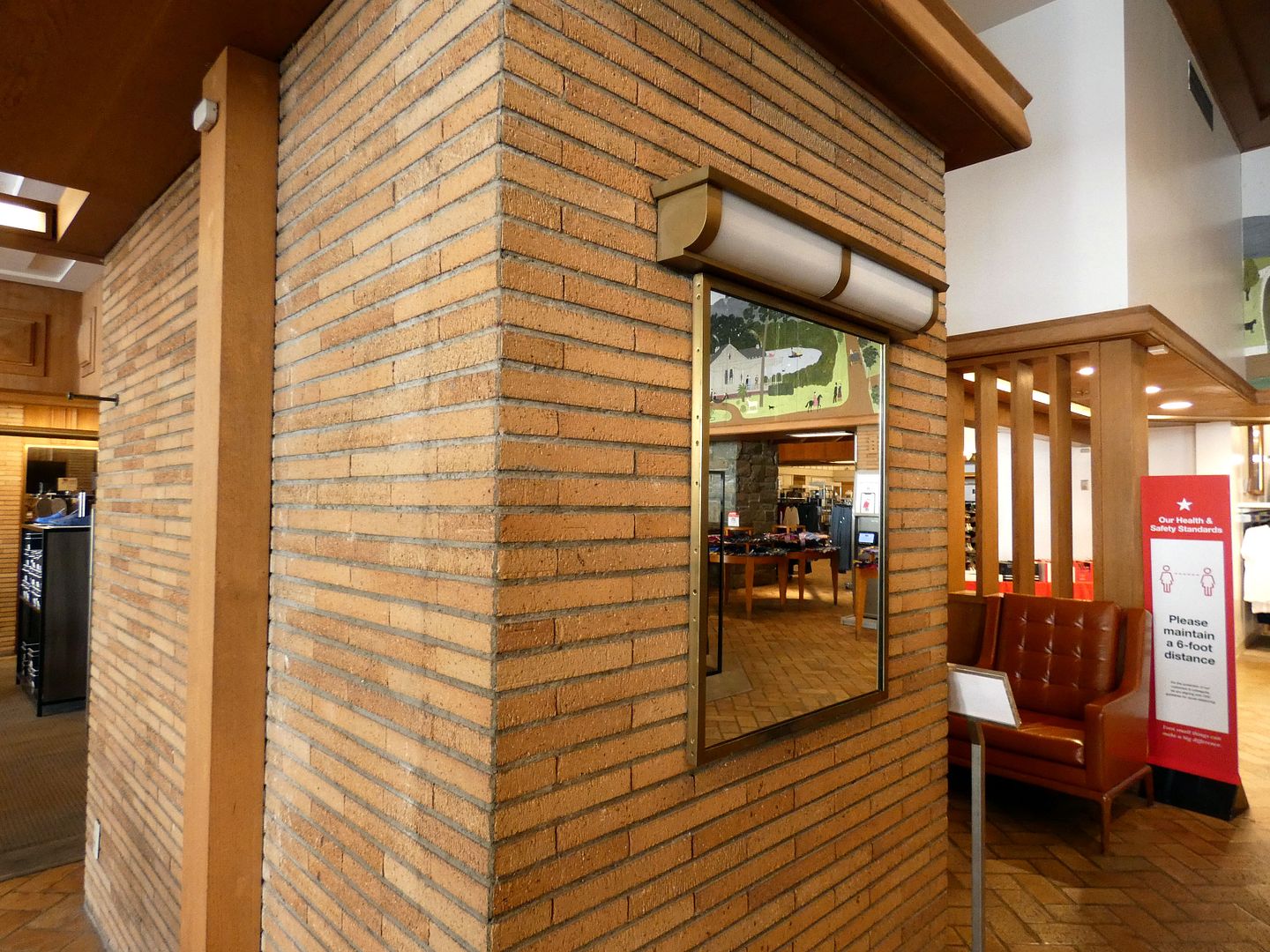
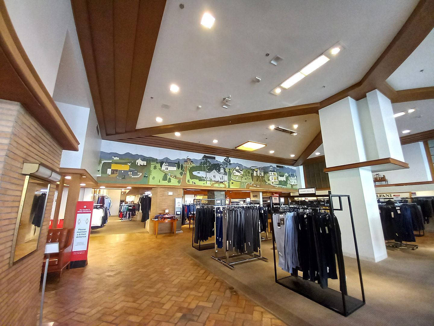
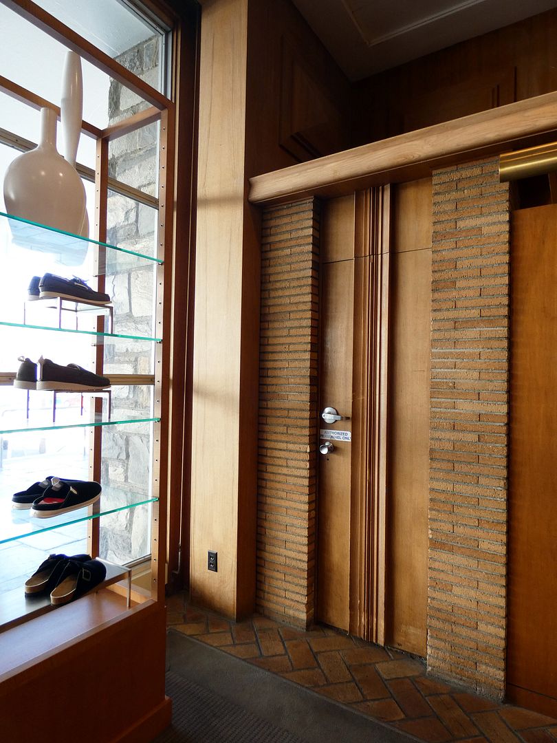
The fireplace's brick pattern matches the columns of the former Women's Sportswear department, their wooden soffits reminiscent of Frank Lloyd Wright's Usonian style.

It's now the men's department, its once-yellow walls now painted white—but still bearing the panorama of Pasadena mural painted by Willing "Wing" Howard.

The tan-colored Roman brick floor of the men's department, tan English woodwork, and copper lighting fixtures create, as the National Register nomination states...

..."a dark-toned, wood-paneled den."

It was so important to create a distinctly masculine experience for the men's department that it even got its own entrance—so that male shoppers wouldn't have to walk through the women's department to get their own shopping done. (This continues today, with standalone Macy's "Mens Stores.")

On the lower level (whose elevator bank features its own unique design)...

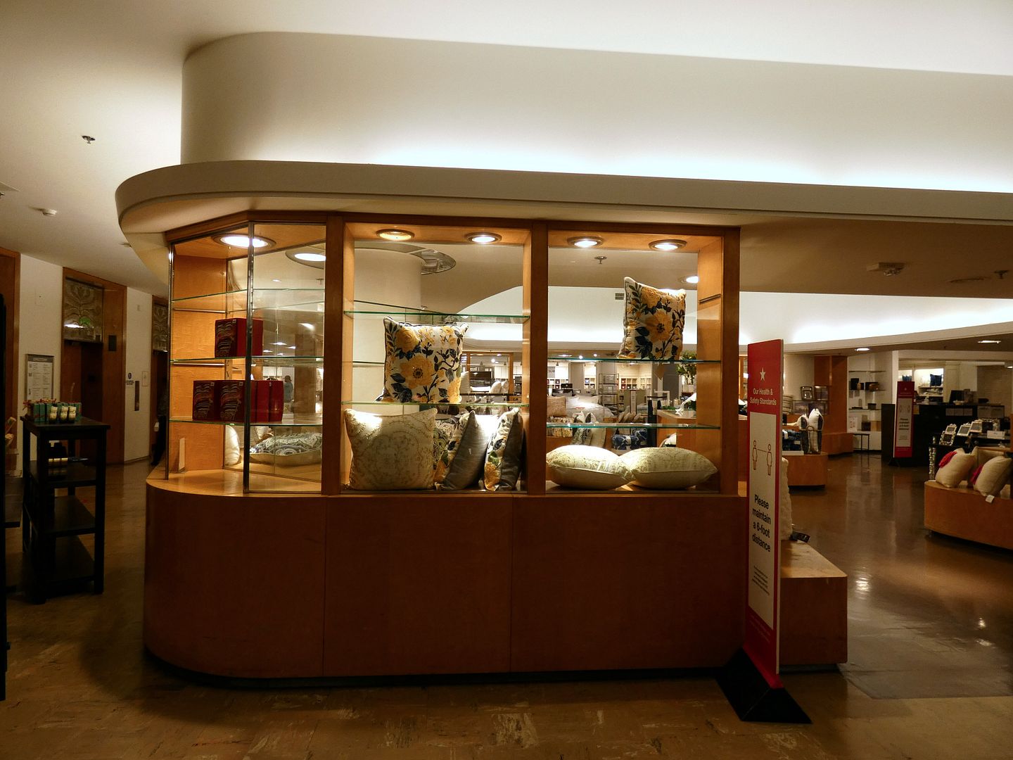
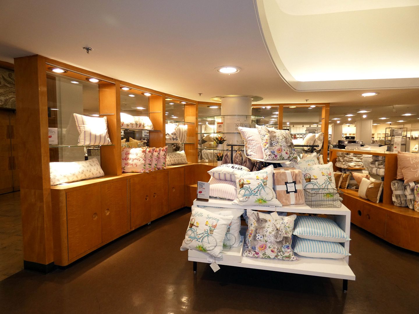
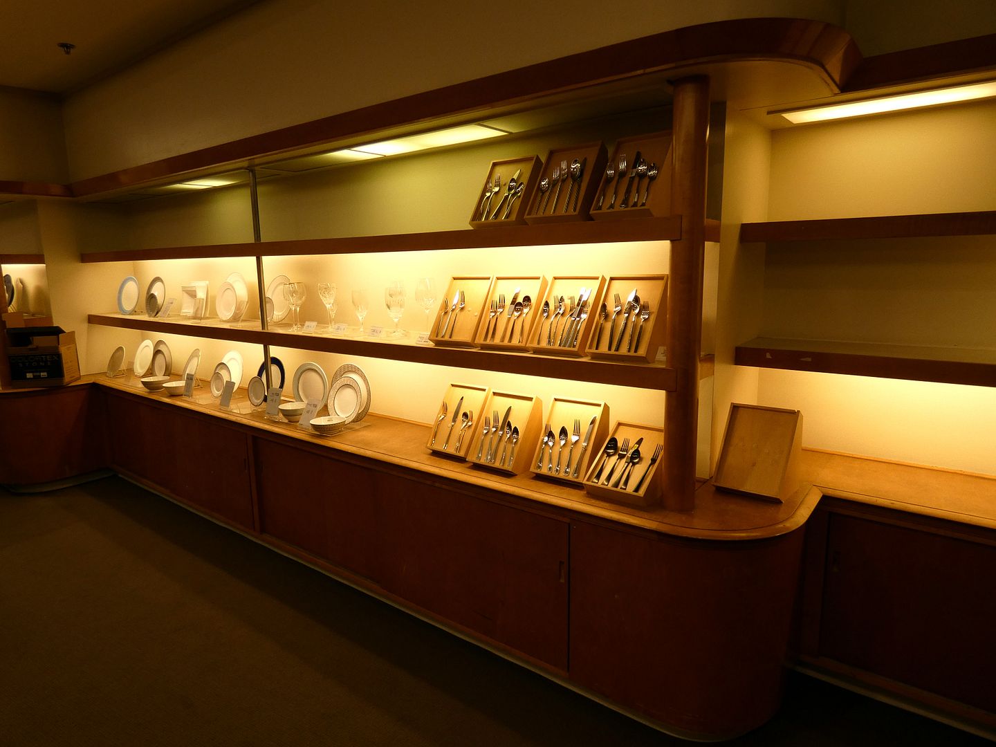
...there's the former Bullock's Home Store, with curved, maple cabinets by furniture maker and industrial designer Paul Laszlo.

Today, seasonal textiles are on display where the "Decorative Accessories" (like ceramics) used to go.

Advertisements (like one that ran in a 1948 issue of Architectural Digest) described the Bullock's Pasadena Home Store as being "dedicated to California living"—where you could enjoy a "friendly informality," consult with experienced sales staff, or simply "find inspiration for a more beautiful home."

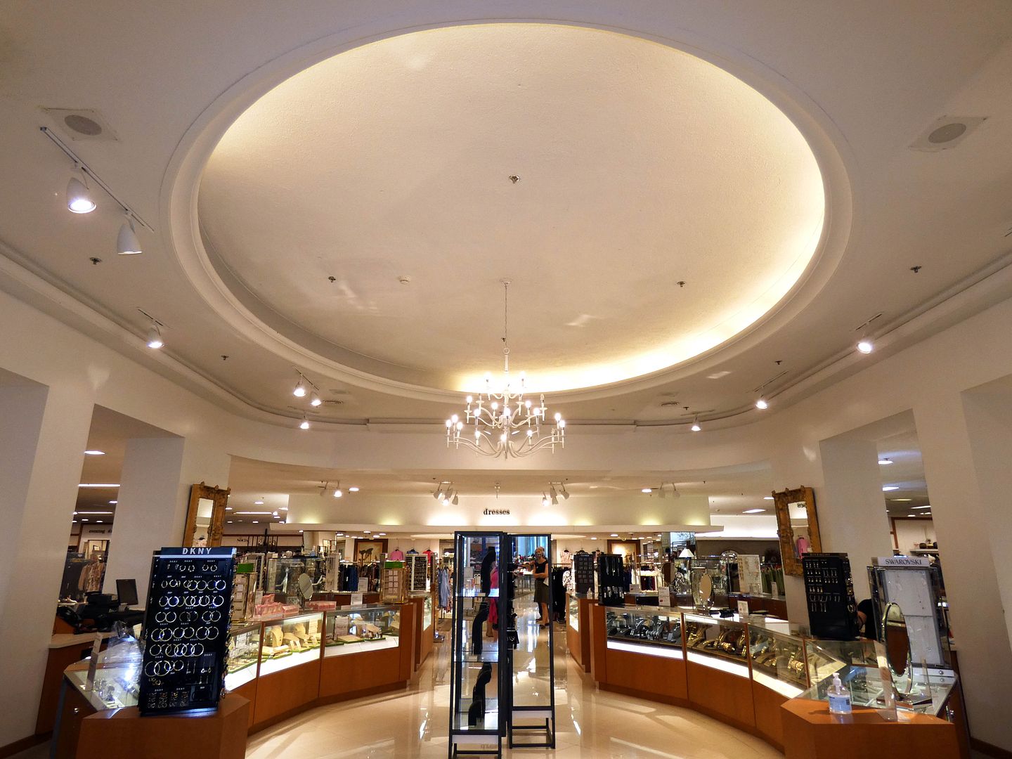
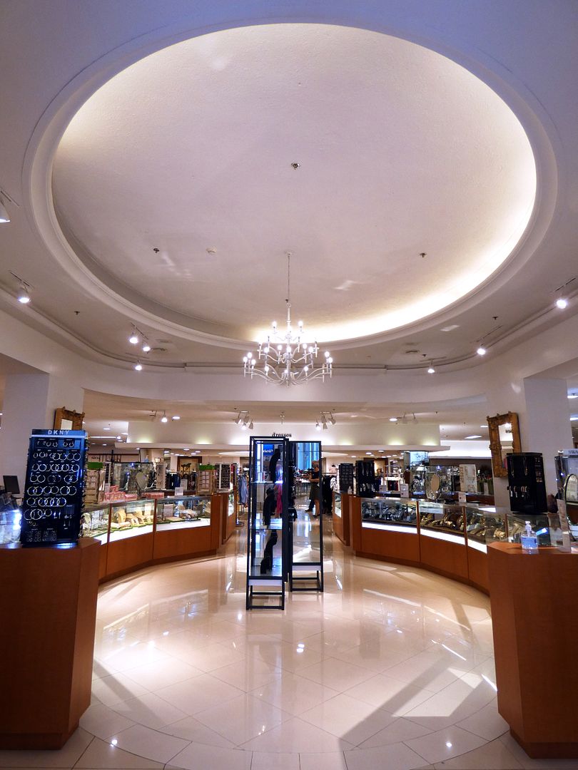
The Lower Level is also where the Fountain Court once stood—complete with leaf-green carpet, white ironwork, and a white chandelier, all reminiscent of New Orleans charm.

Despite the fact that it had come to represent Bullock's Pasadena itself—appearing on the cover of Architectural Digest (Volume XII Issue 1, published 1948) and hosting the store's annual Christmas tree display—it was unfortunately removed in 1990 and replaced by a cosmetics counter (though now it's where the jewelry counter stands).

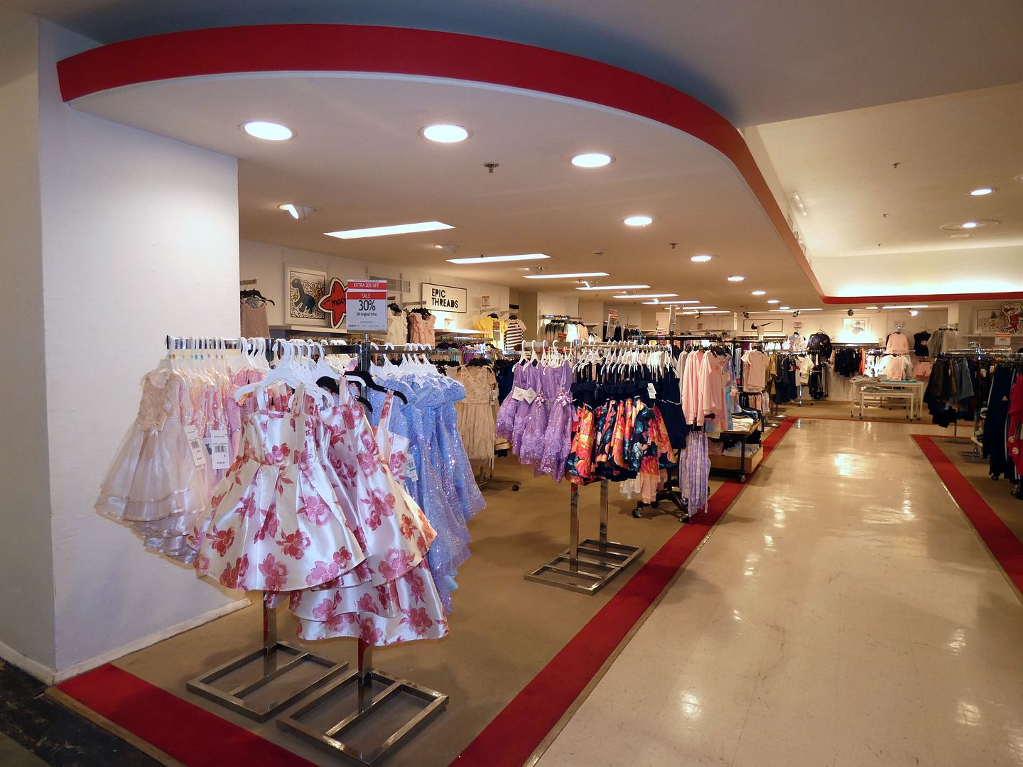
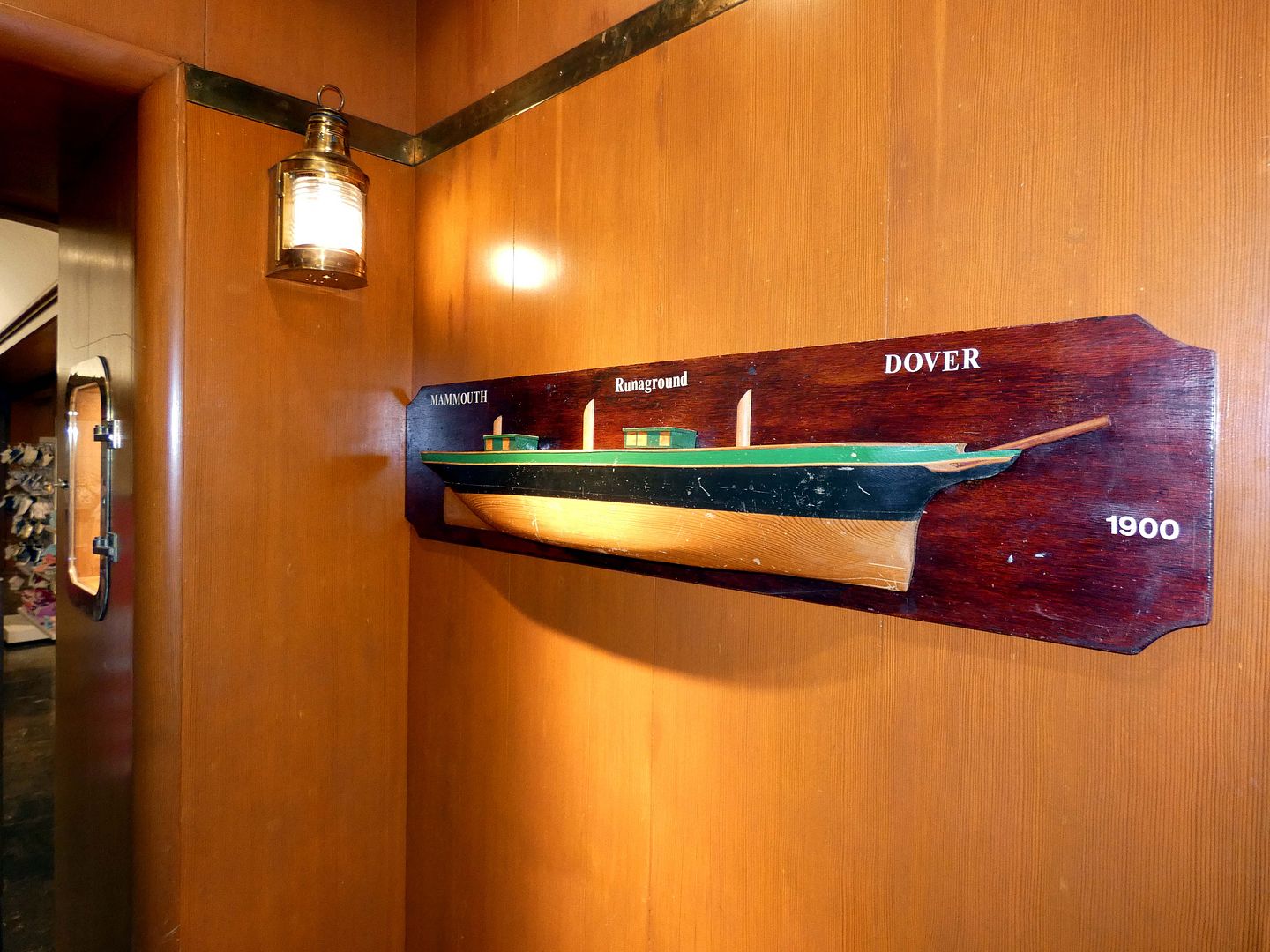
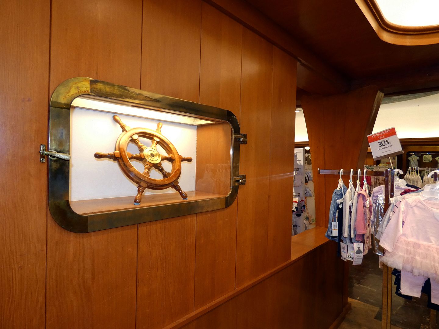
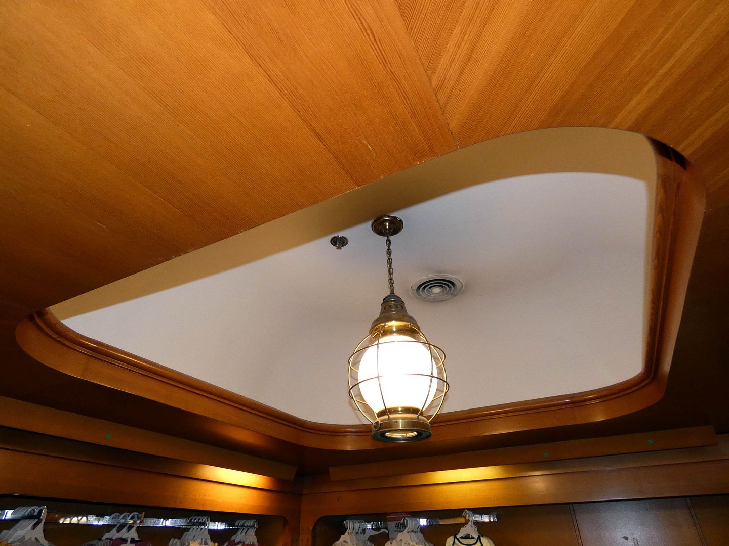
On the Upper Level, the Streamline Moderne curvature of the children's department ceiling offers just a hint of what's to come in the former "Ship Room"...

...a nautical wonderland for any sailor-in-training...

...with porthole-style display cases and blond-colored pine woodwork, paneling, and doors...

...all illuminated by ship lanterns.
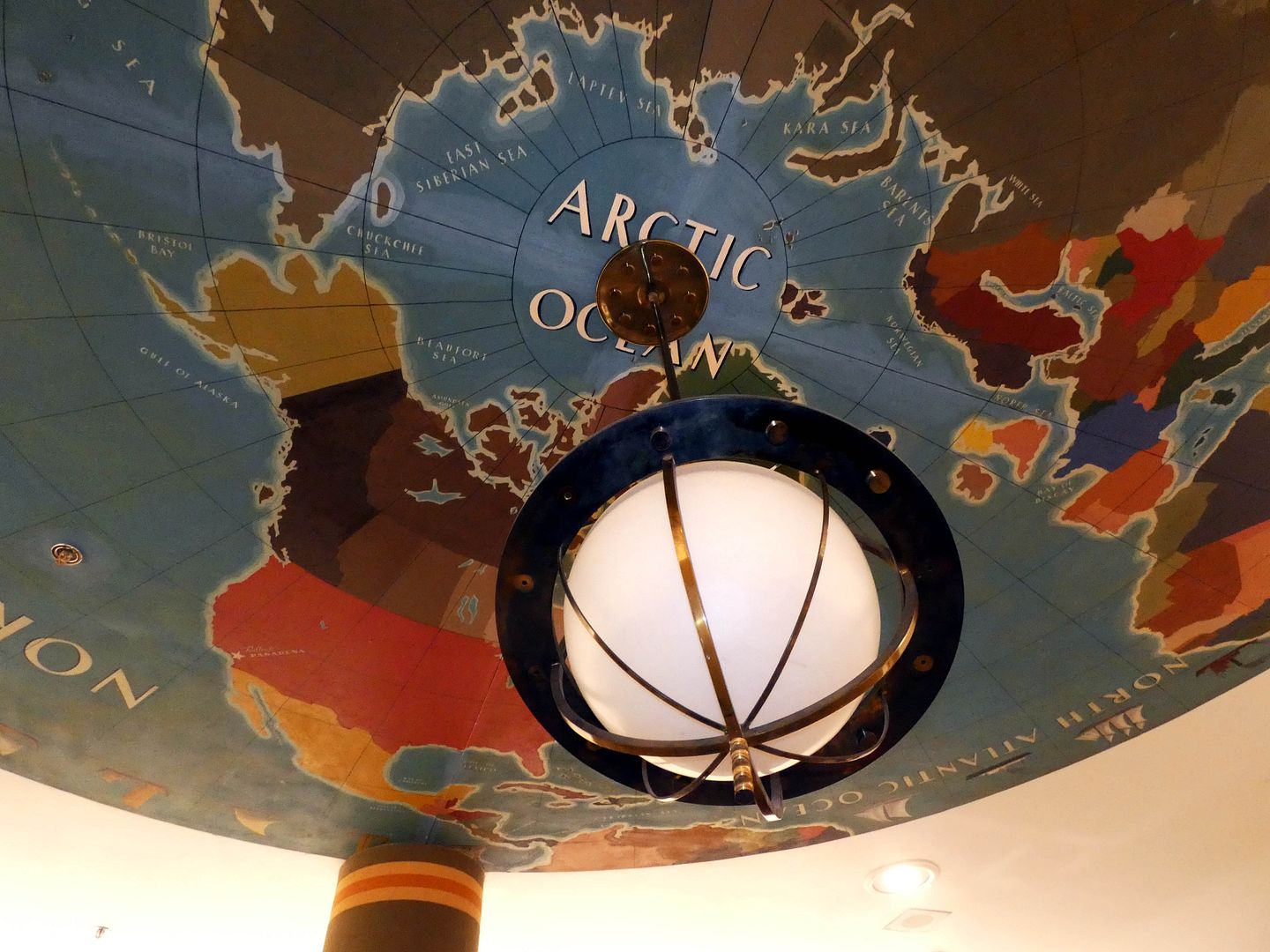

Also formerly known as The Boys' Shop, it features a ceiling mural of the globe by Robert Majors.

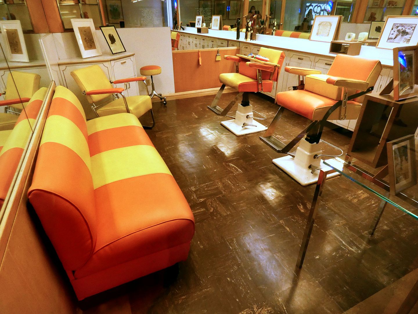
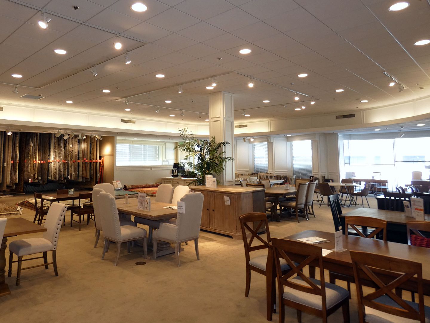
One of the most amazing aspects of the original Bullock's Pasadena—still preserved in amber by Macy's—is the Children's Hair Styling Salon, originally part of the Children's Toy Department (now the Furniture Gallery). It operated from 1947 to 2019 (when its main hairdresser, Dora, retired).

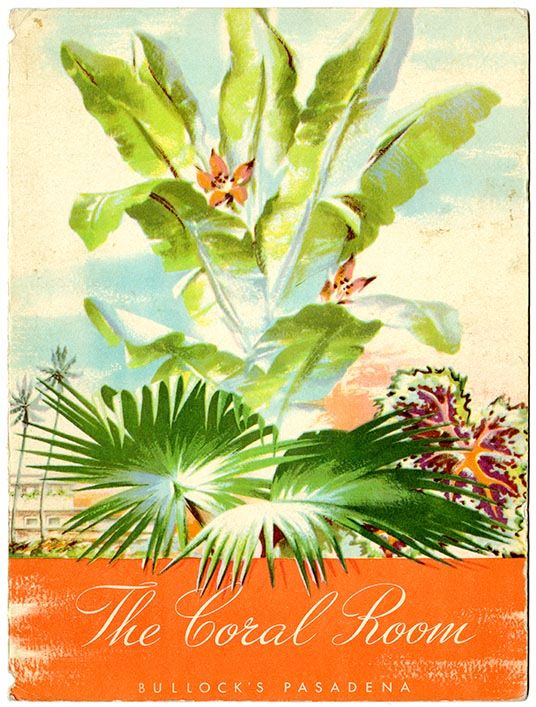
The Upper Level is also where shoppers could take a break and get a nosh at The Coral Room tea room/restaurant—so named for its formerly coral-colored upholstery and walls. (The palm tree carpeting and tropical murals by Annette Honeywell are also long gone.)

Bullock's as a department store chain was known for its tea rooms—and this one was home to luncheon fashion shows, breakfast with Santa, and Bob Baker Marionette Theatre puppet shows.

Menu (circa 1955): California menu collection, courtesy, California Historical Society (via Flickr)
And, of course, you could also order afternoon tea, every day except Monday.

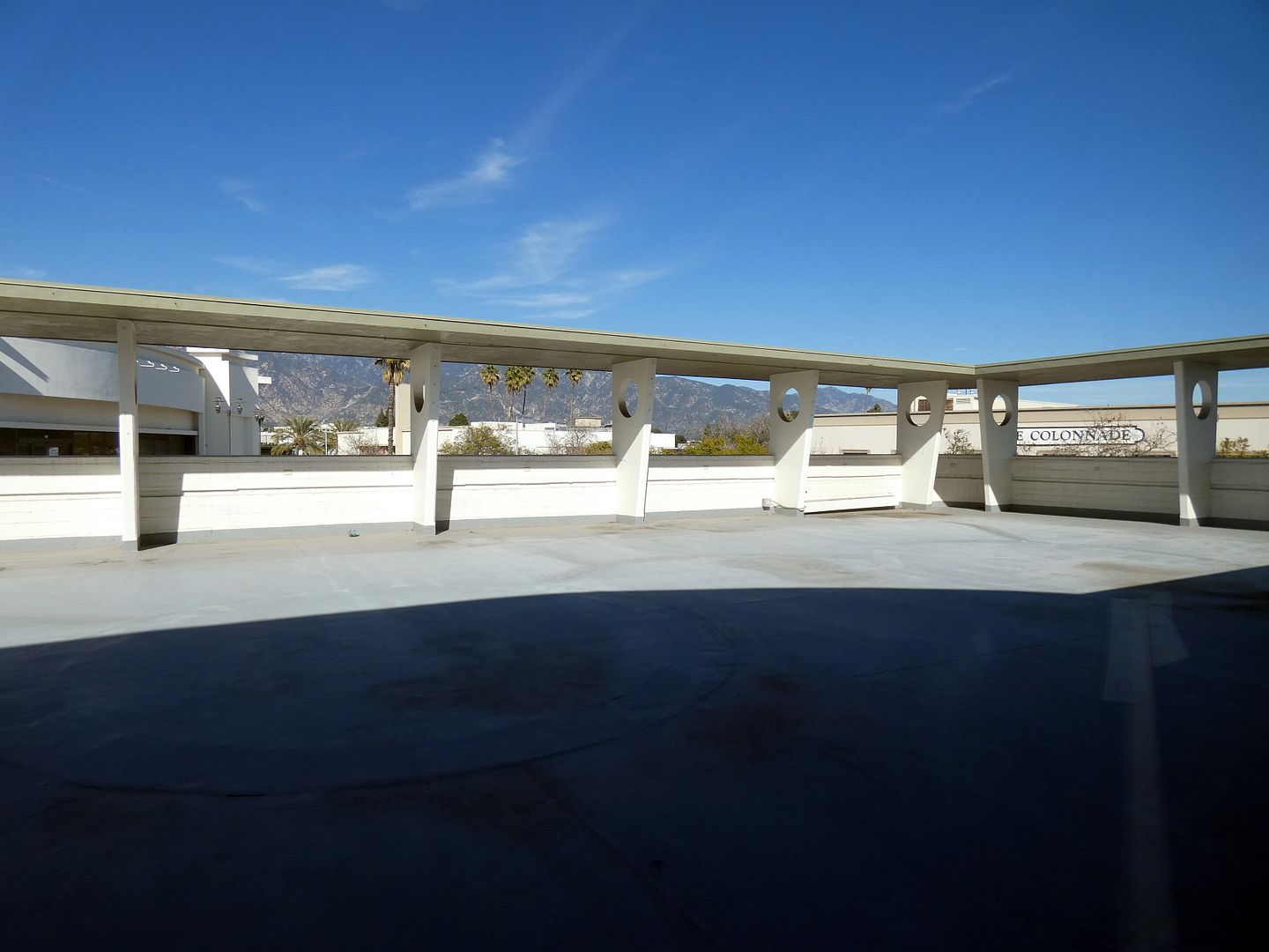
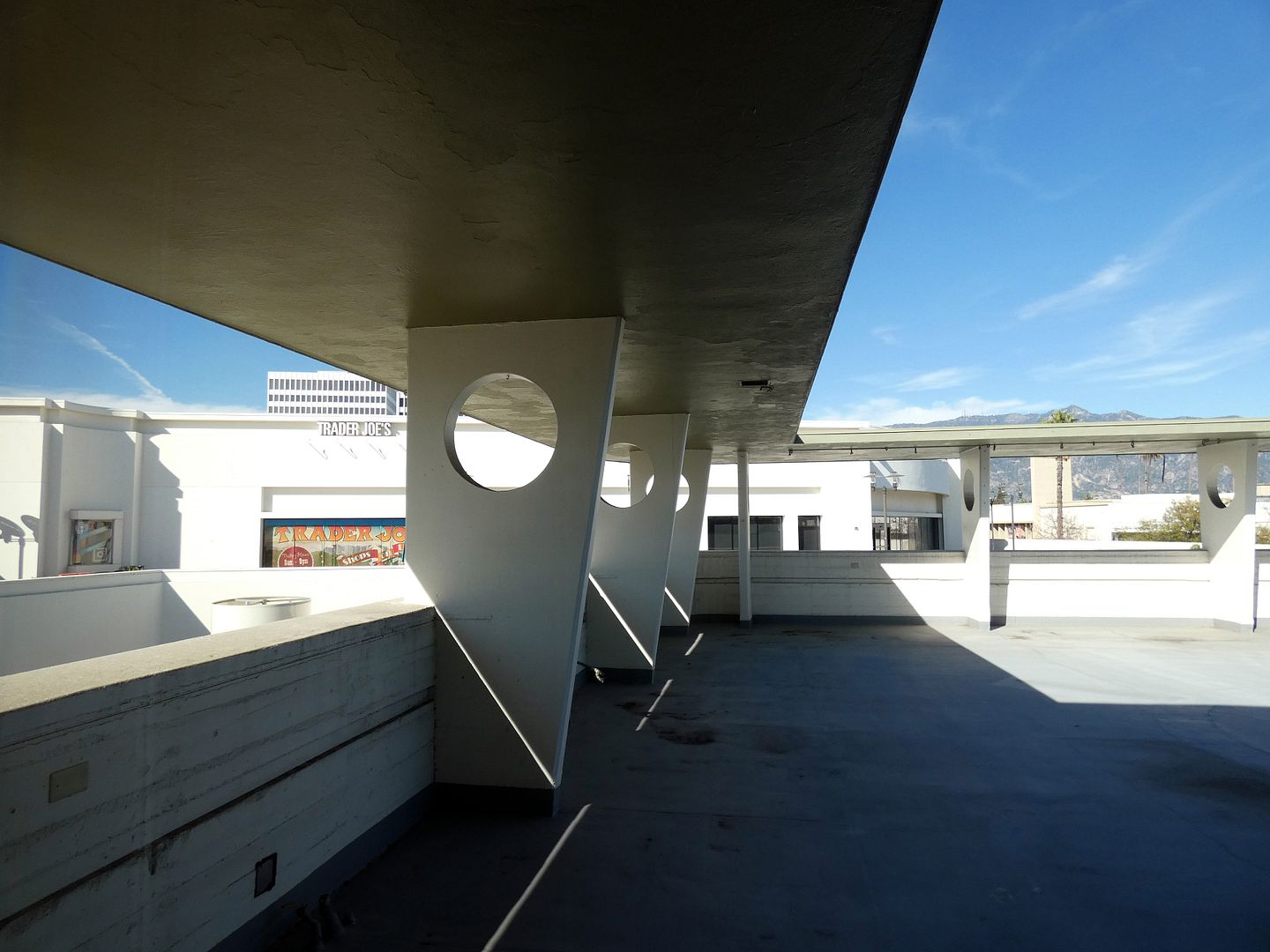
You could even sit out on the outdoor dining terrace (or "upper deck" of the ship) in one of the little mini cabanas that were scattered between the parapet walls, which featured flat pylons with circular cutouts (reminiscent, again, of portholes but also a feature of Googie architecture).

So, how did Bullock's Pasadena become a Macy's? Well, Federated Department Stores bought the Bullock's chain in 1964, keeping the Bullock's branding for over 20 more years, and then sold it off to R. H. Macy & Co. in 1988.
After Macy's declared bankruptcy in 1992, Federated stepped back in and acquired the chain, changing all remaining Bullock's stores to Macy's by 1996. (Bullocks Wilshire had kind of spun off to become its own thing—and its flagship on Wilshire in Los Angeles had already closed in 1993 anyway.)
Macy's was criticized at the time for taking the SoCal focus out of this "store for all Southern California"—replacing Bullock’s locally-savvy buyers with those working out of a regional office on the other side of the country.
But this location was later praised for its renovation and restoration of historic elements, which can still be seen today. And that makes Macy's Lake Avenue both an interesting shopping excursion and kind of a museum visit, too.

Excellent article. But, words and photographs cannot replace the actual experience of a site visit. Kudos to all who helped and continue to help preserve this masterpiece of time and place...that continues to function as a retail shopping destination.
ReplyDeleteThis was absolutely an amazing article. I was wondering about what happened to the Big wedding portraits that were in the Pasadena Bullocks.
ReplyDeleteI'm not sure but Pasadena Heritage might know!
DeleteI was one of two Pasadena High School Reps 1968/1969 working in the Teen Department. We also were Santa helpers in December, I was the Easter Bunny for the Tea Room Easter Breakfast in1969, plus we modeled monthly in the Tea Room. A fabulous experience!
ReplyDeleteJean Fenoglio